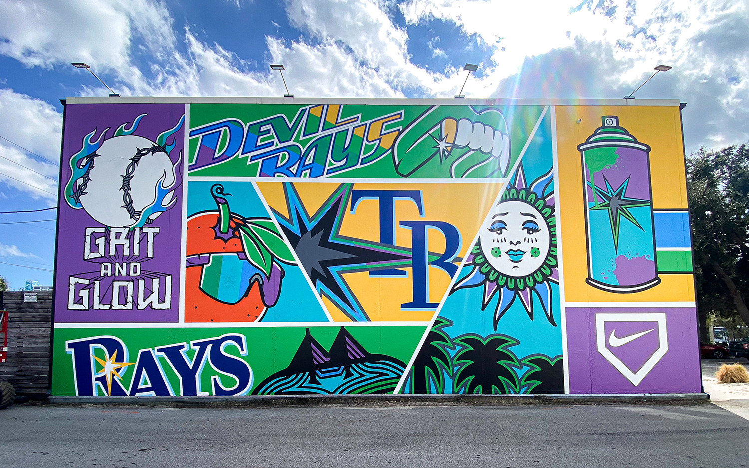
Rays × Fanatics × Nike “Diamond” Mural: Where Sport Meets Street
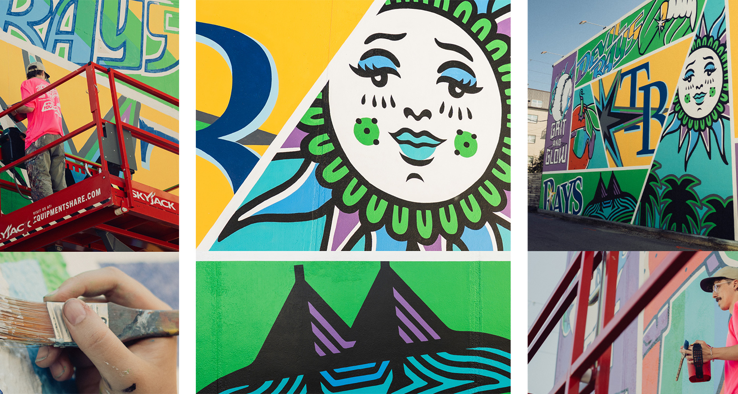
When the call came in to collaborate on the mural project for the Tampa Bay Rays × Fanatics × Nike “Diamond” initiative, Greater Public Studio (GPS) jumped at the opportunity to merge brand identity, skate/street culture and city energy into a singular visual statement. The result is a dynamic mural that sits at the confluence of sports branding, street‐level authenticity and creative illustration—bringing together multiple worlds in one wall.
Here is an in-depth look at how this mural came to life: from the assets we brought in, the cultural signals we tapped into, our design strategy, and why this wall matters.
1. The Creative Foundations
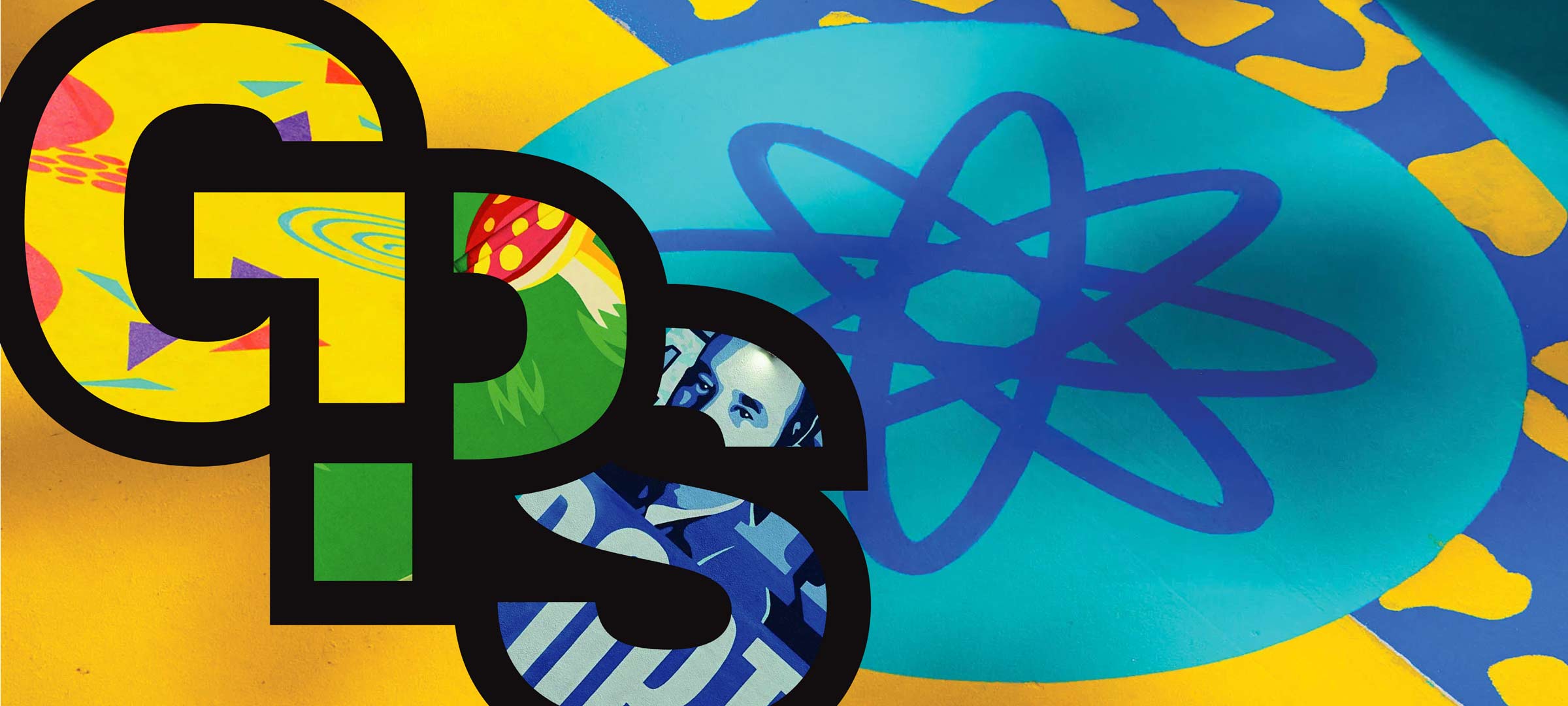
At the heart of the mural’s visual energy are illustrations contributed by Sonny James Creative. This studio, known for sports design, packaging, print and illustration work, provided a strong visual vocabulary on which we built the work.
Meanwhile, on the client/brand side, the Rays “City Connect” initiative supplied creative materials—logos, pattern assets, brand colours, typography, visual motifs—from the Fanatics/Nike/Rays ecosystem. GPS’s role was not to generate all illustrations from scratch (typically what we’re aiming to do), but rather to filter, adapt, arrange and amplify pre-existing assets into a mural that speaks to downtown Tampa Bay Area, skate culture, and the visual language of the city.
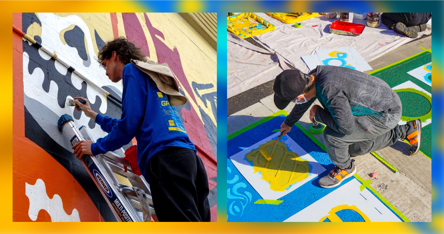
This distinction is important: as a studio we usually only paint illustrations that we have directly co-created or drawn ourselves. But in this case, given the brand‐asset collaboration, our job shifted into a creative curatorial role: we took the provided creative assets and composed them into a hand-painted mural that embodies ‘grit and glow’.
2. GPS + Skateboarding Culture
One of our internal levers for inspiration came via our head coach/designer Jay, who has been deeply immersed in skateboarding since he was 9 years old. Jay’s background as a skateboarder and sticker-head (collecting, slapping, trading brand decals, skate-brand icons) fed the mural’s visual DNA. When you live the sticker/decal/swapping culture, you perceive shapes, icons, patterns, torn posters, slaps and urban textures differently—and that informed our design path.
At GPS we support skateboarding through various street projects and our extensive collection of skateboard decks (established and emerging brands alike). The culture of decks, grip tape, stickers and skate-brand visuals echoes the energy of street art, youth brands and urban subculture; it provided a natural bridge between the sports brand world (Rays × Fanatics × Nike) and city/skate authenticity.
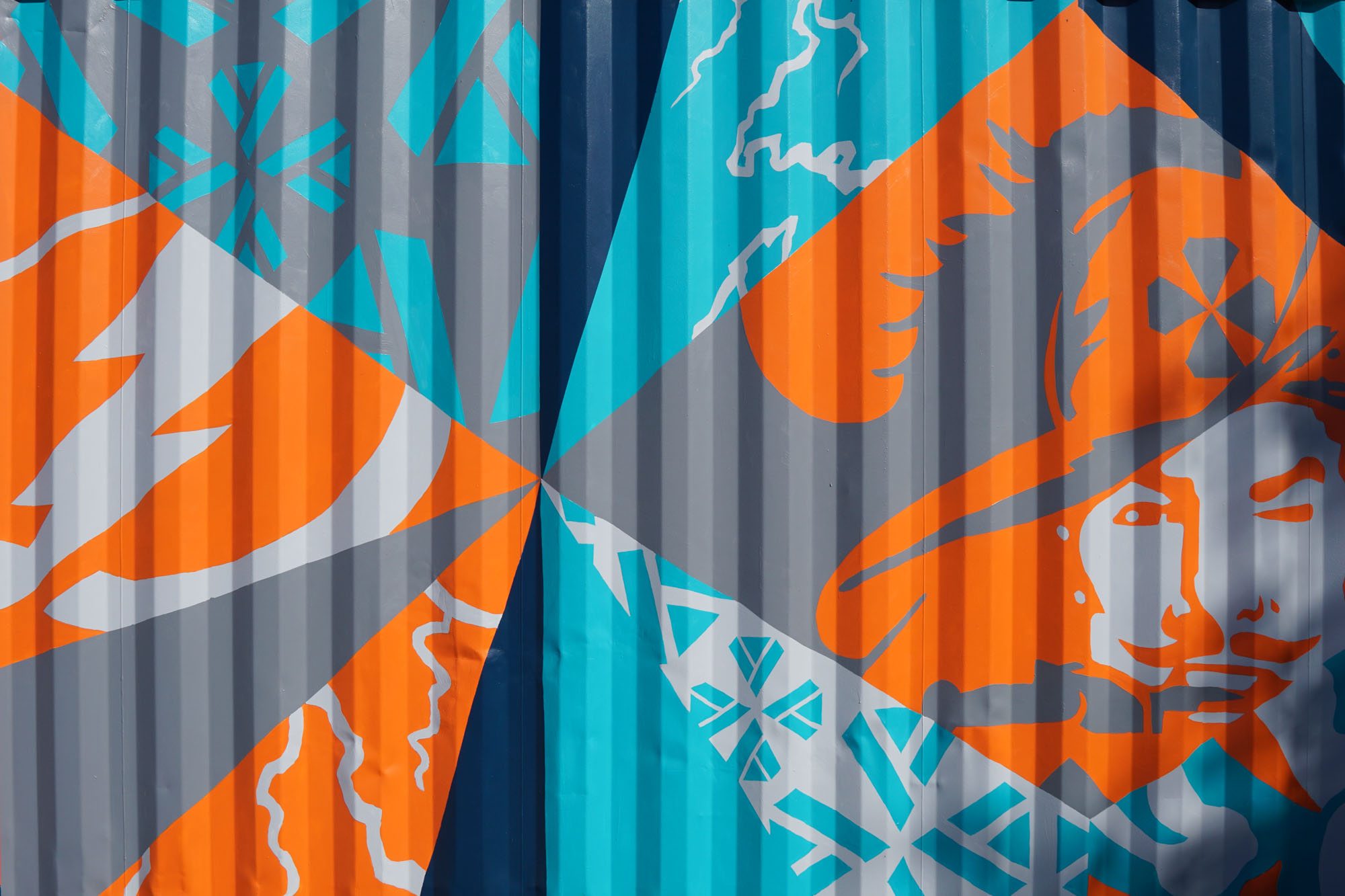
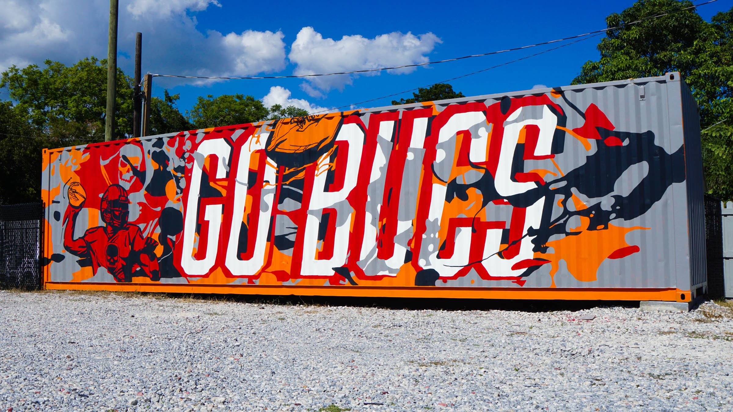
3. The Chosen Motif: Grip Tape Patterns & Geometric Edge
For the visual motif we chose a pattern inspired by classic skateboard grip tape designs. Why grip tape? Two reasons:
- Historical technique: Many skaters only have a box cutter or razor blade to trim the edges of the newly applied grip tape. Patterns often emerge precisely because of tool limitations—straight lines, geometric cuts, exposed deck graphics, negative space reveals.
- Sticker / graphic interplay: On the top of a board you’ll often find stickers, illustrations, and branded graphics. Cutting into the grip tape reveals those underlying layers. Essentially the grip tape becomes a stencil, a mask, a reveal mechanism—visible, tactile, deeply embedded in skate culture.
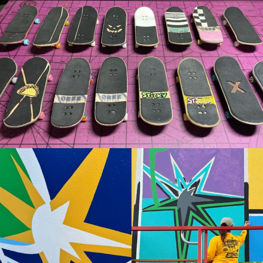
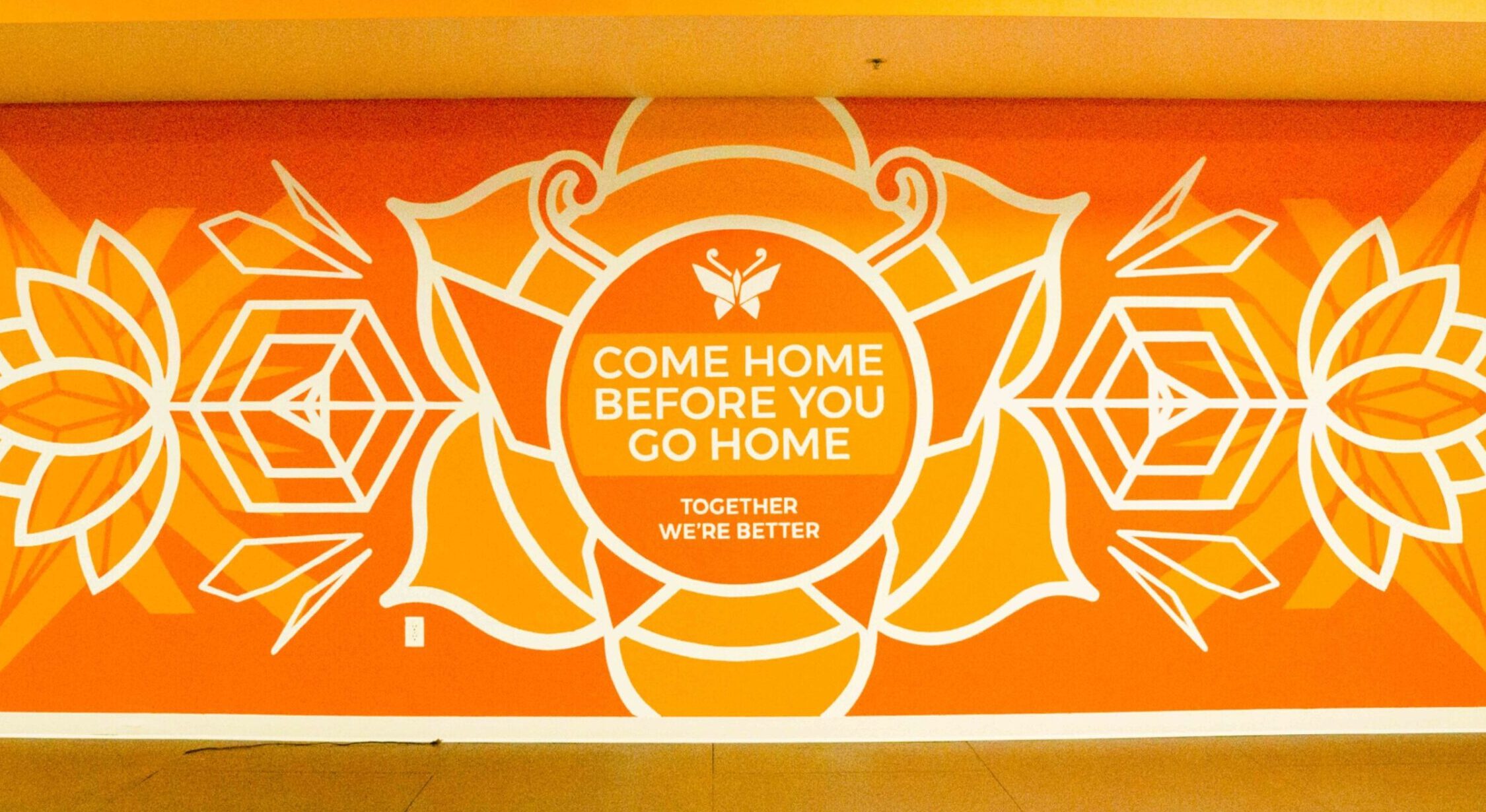
In our mural we translated that logic into wall scale: repeating geometric forms, masked shapes, negative space that reveals branded and illustrated elements beneath, as if the wall were the deck. By leveraging that metaphor, we anchor the sports brand world into skate/street culture.
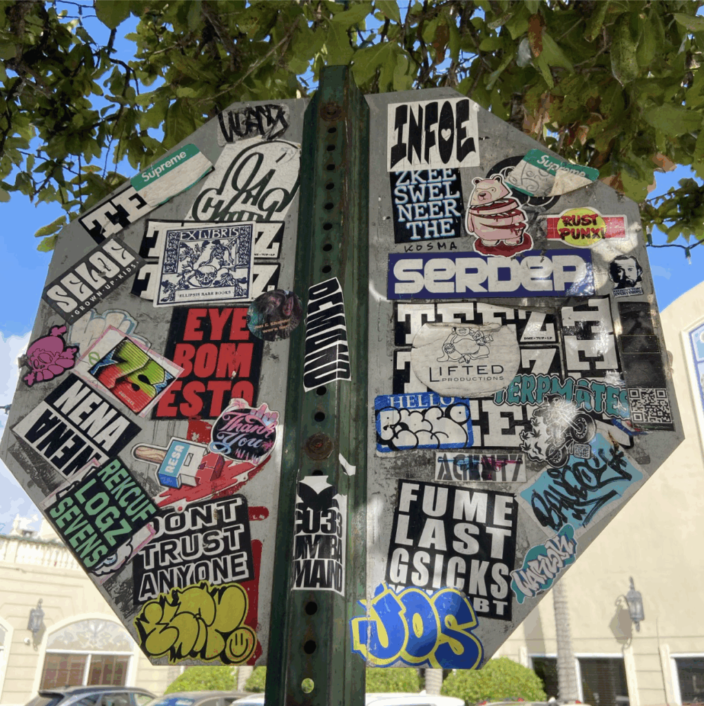
4. Street Culture Signals: Torn Posters + Sticker Slaps
In the early proposal phase, we considered drawing inspiration from two prominent visual languages within street culture: torn posters and sticker slaps.
Torn Posters: Street art and paste-ups often appear as layered, weathered posters—edges curling, colors fading, fragments revealing older graphics beneath. This visual language speaks to urban life’s texture and impermanence, symbolizing how culture builds layer by layer over time.
Sticker Slaps: Likewise, skateboarders and street artists have long used sticker slaps—small decals, logos, and tags—adhered to walls, poles, benches, and boards. These quick, repeatable marks create informal networks of identity and community, leaving behind traces of subculture wherever they land.
While these motifs were ultimately not included in the final design, they played an important role during conceptual development. The exploration helped refine our direction toward a cleaner, geometry-driven mural that still carries the spirit of street culture—without directly replicating its visual tropes.
5. Execution: From Assets to Wall
Working through the process:
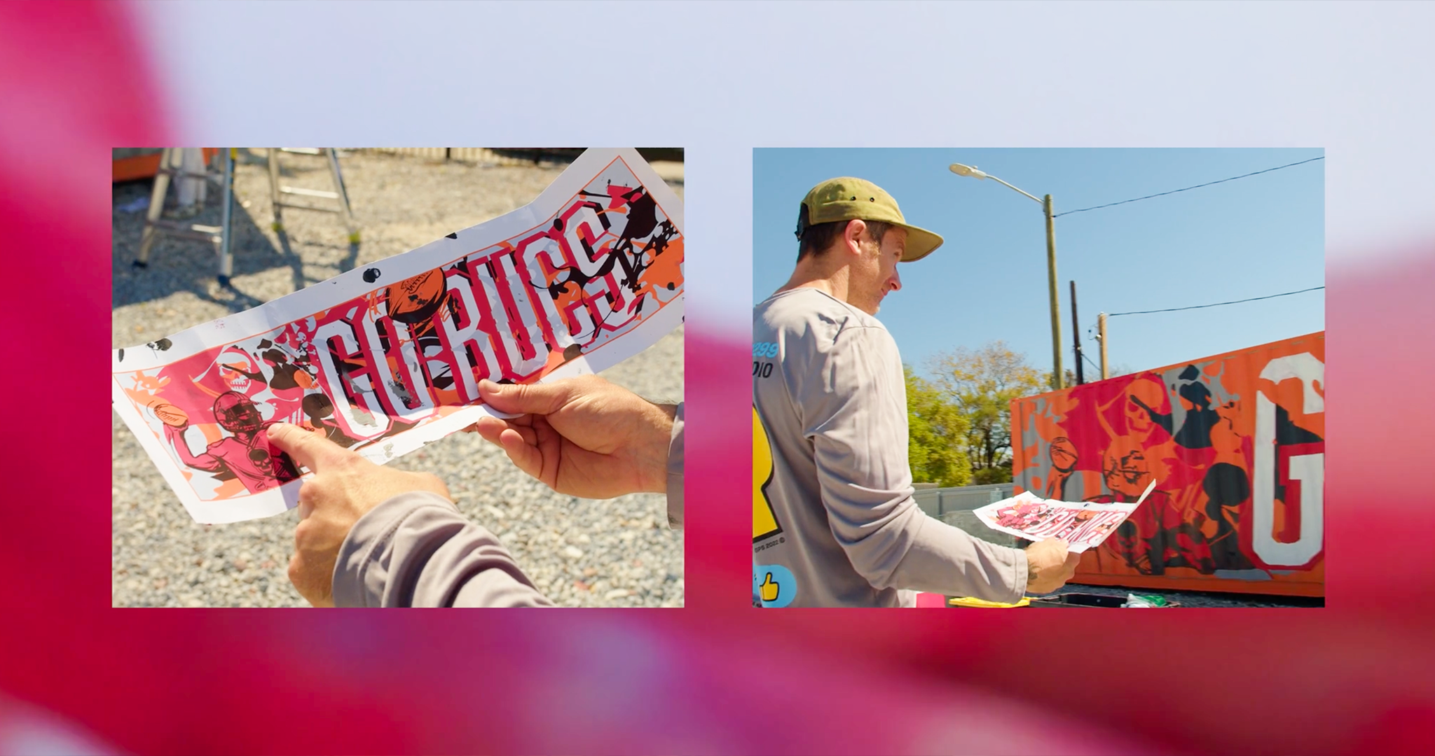
- Asset Intake & Curation: We received the Rays City Connect assets, the Nike logos, and illustrations from Sonny James Creative. We mapped out which elements could be arranged into the mural rather than wholly invented.
- Motif Development: We translated the grip‐tape idea into a wall grid; we tested geometric repeats, negative-space reveals, branded motifs masked beneath the pattern.
- Composition: We designed mockups of three versions—each with slight variation in how the pattern reveals the branded graphics, urban texture depth, and scale to site. These mockups allowed us to test how full‐wall scale would read from the street, as well as mid-distance (for photos, for passers-by).
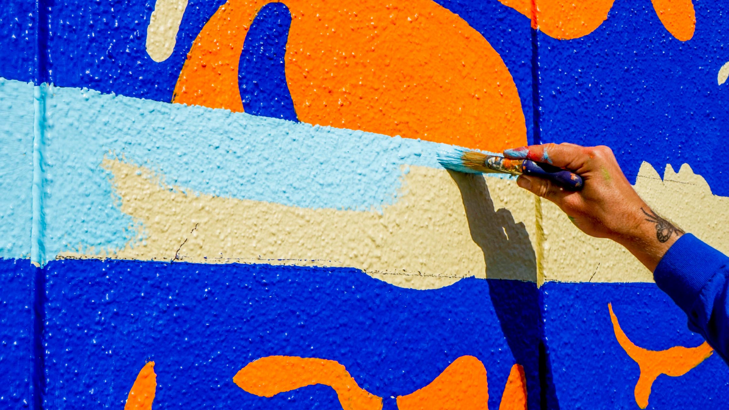
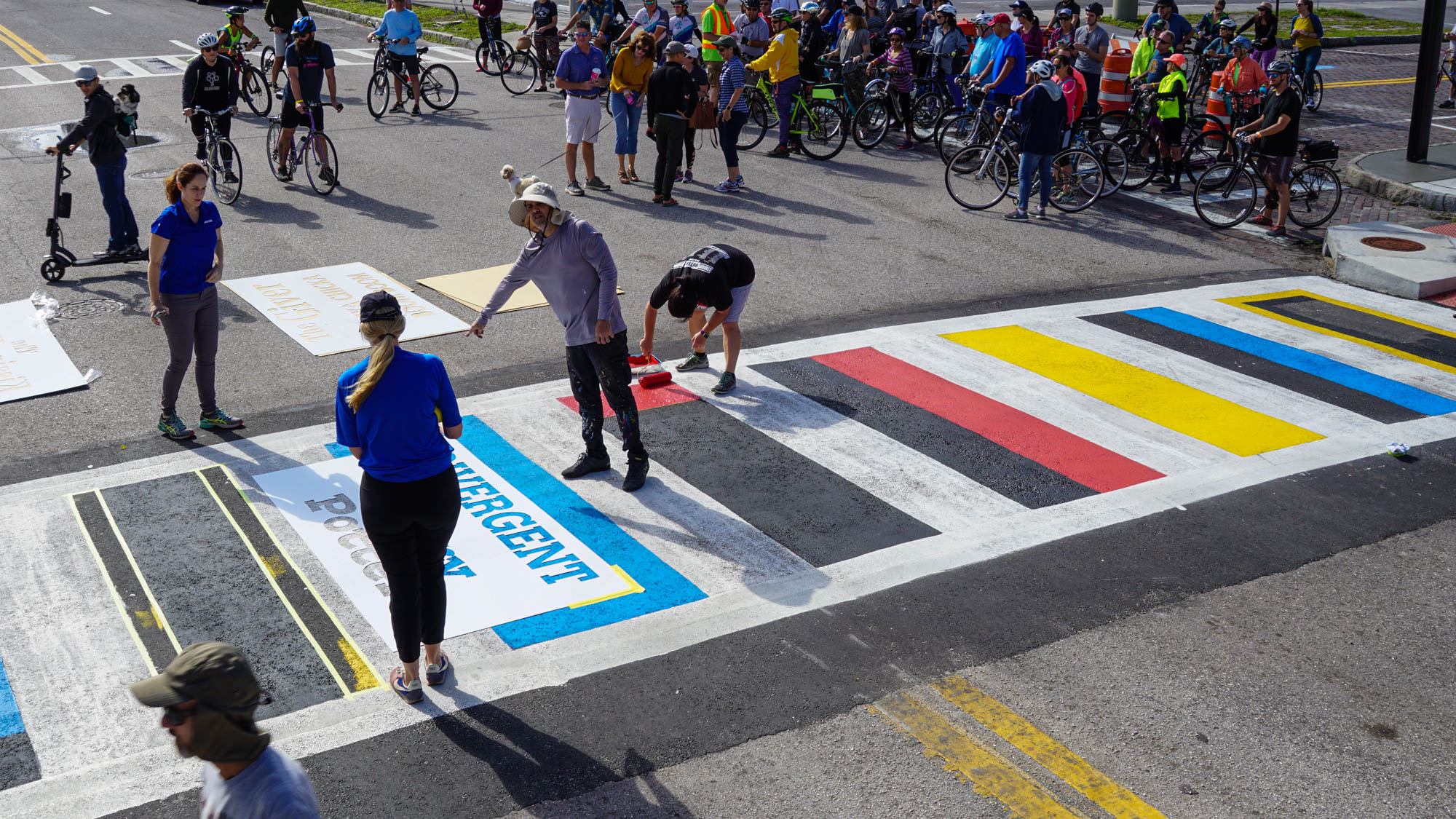
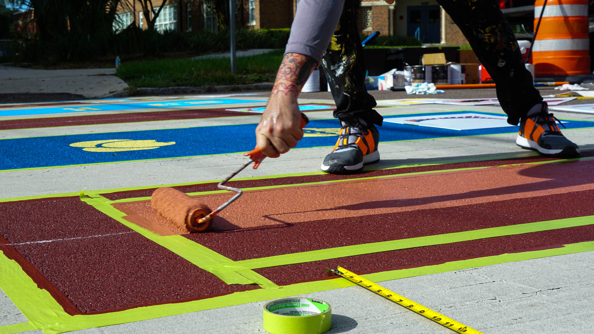
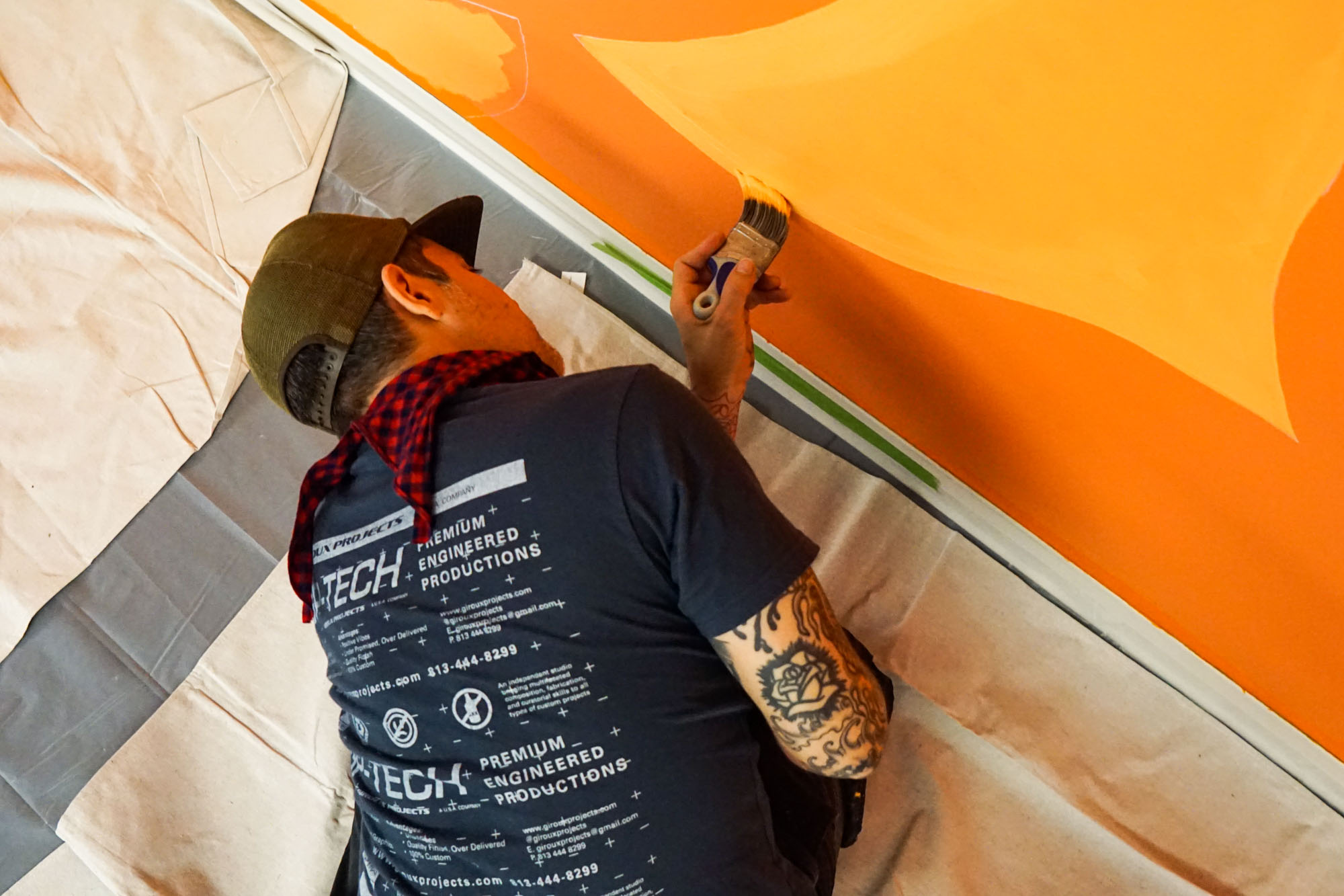
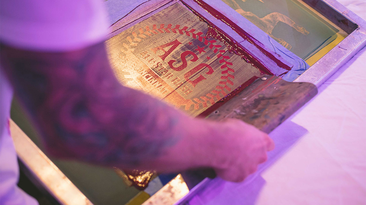
- Color & Material: We served as the painting team for this project, bringing the approved design to life with precision and craftsmanship. The mural was executed entirely with high-quality satin exterior paint from Sherwin-Williams, chosen for its durability, color retention, and smooth finish. No spray paint was used in the process—this was a deliberate decision to ensure the longevity and weather resistance of the work. By relying on brush and roller application, we achieved a clean, consistent surface that will maintain its vibrancy and integrity for years to come.
- Final Touch: As a finishing gesture we included credit to Sonny James Creative in the mural’s lower corner along with our signature, discrete yet visible—a nod to the collaborative nature of the project.
6. Why This Mural Matters
- Brand & Culture Intersection: The project brings together a major sports franchise (Rays) and global brands (Fanatics and Nike) with local narrative (Tampa urban/street culture) and skateboarding roots. The result is not a typical brand wall—it’s a hybrid expression of sport, brand, street, skate and city.
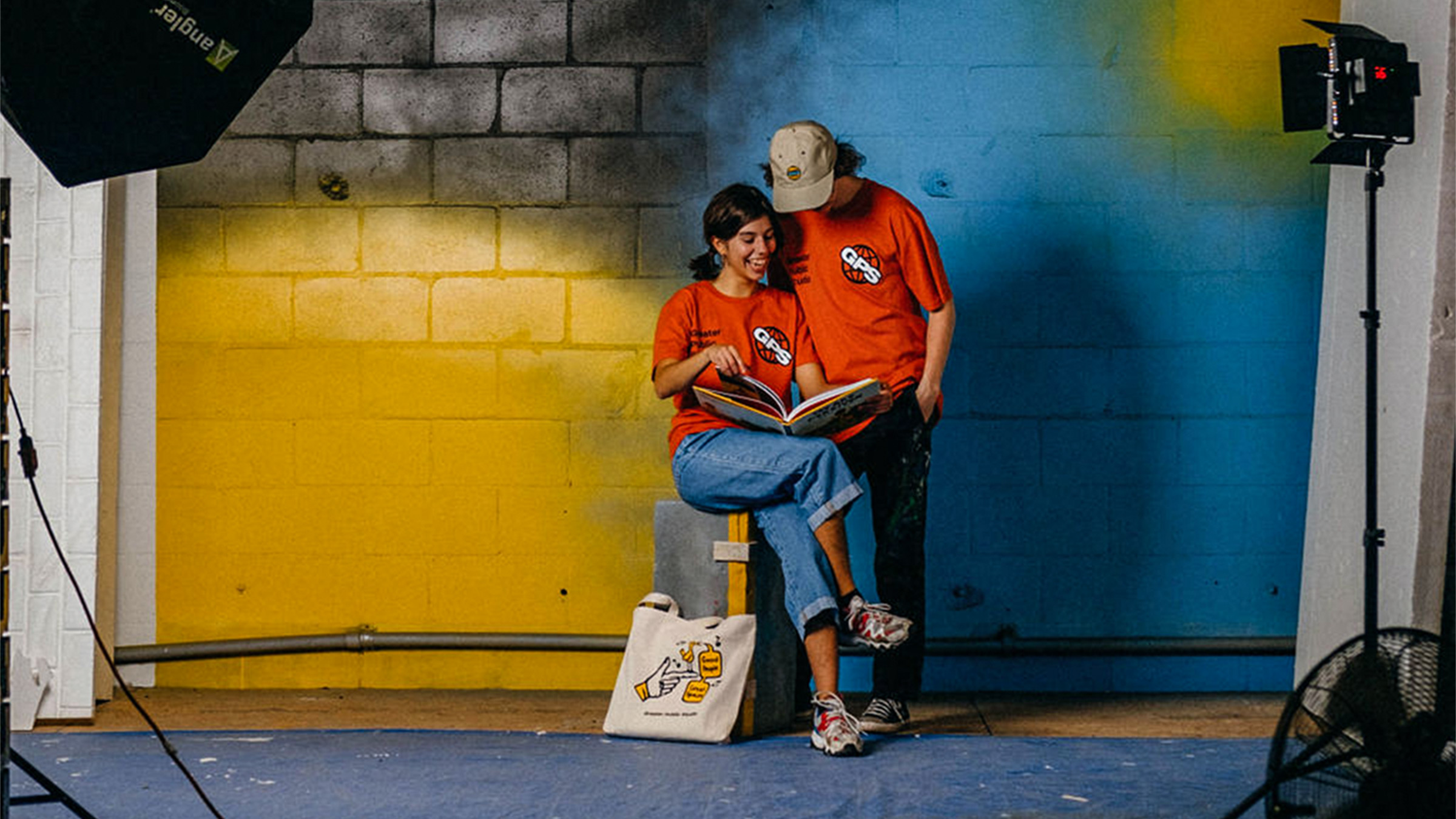
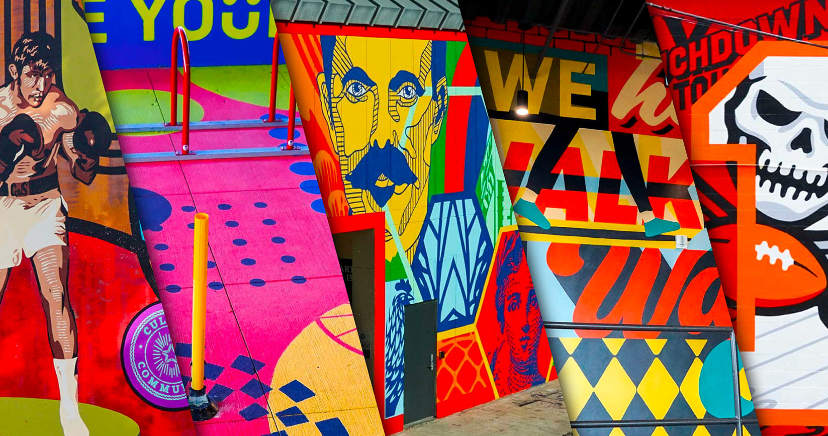
- City Engagement: As a mural by GPS in Tampa, it contributes to the city’s growing public-art ecosystem. GPS has worked on murals in the region for years—hand-painted work that resonates with the spirit of Tampa.
- Authenticity: Because we leaned into skate and sticker culture (via Jay’s background) the result has a credible, sub-cultural edge rather than a purely corporate “poster wall.” It invites glance, layering, exploration.
- Visual Richness: By blending pattern, reveal, texture, brand graphics and street art cues, the mural delivers visual complexity that rewards repeated viewing—passers-by, social media shots, day/night light shifts will all engage the wall differently.
- Collaborative Credit: The mural acknowledges its multi-hand genesis: Sonny James Creative and Greater Public Studio. That transparency strengthens the narrative of creative collaboration.
7. Key Points Recap
- We brought in illustrations by Sonny James Creative as the core visual input.
- We utilized creative materials from the Rays City Connect initiative, provided by the brand team.
- Uniquely for GPS, we didn’t originate the illustrations ourselves; instead, we filtered and composed the pre-existing assets into a mural motif aligned with city and skate culture.
- Our head coach/designer Jay’s deep skateboarding and sticker-head background informed the cultural authenticity of the approach.
- GPS supports skateboarding culture more broadly—skateboard decks, emerging brands, street culture—so the mural sits naturally within that ecosystem.
- The final visual motif was inspired by classic grip tape patterns: geometric in nature, born from limited tool sets (razor blade/box cutter) and the concept of exposing the deck graphics beneath.
- We referenced the fact that graphics and stickers appear on the skateboard deck top; by cutting patterns into grip tape, skaters could expose those graphics—this metaphor migrates to the wall.
- Additional visuals incorporated include grip tape patterns (skateboarding), torn posters (street art), and sticker slaps (both).
- The mural pays homage to the shared isolated icon set—with credit to Sonny James Creative and MLB/brand teams for their contribution.
8. Final Thoughts
In a city like Tampa, where the urban environment, sports culture and skate/street worlds all converge, this mural is more than decoration—it’s a bridge. It connects the stadium crowd with the street crowd; it links brand activation with skate authenticity; it elevates a sports-branded wall into a city cultural moment.
We appreciate the trust of the Rays / Fanatics / Nike brand team, the inventive illustrations of Sonny James Creative, and the willingness to lean into skate/street culture as the foundation rather than as an after‐thought. It’s a wall that will age with the city, garner social-media passes, invite skaters, fans, passers-by and brand followers alike.
In closing: this is one mural, but it sits at many intersections. Sports. Skate. Street. City. Brand. Art. We hope it reflects the layered energy of Tampa, the spirit of game‐day crossed with night-life, and the aesthetic grit of skate culture turned up to wall scale.