Art & Sports
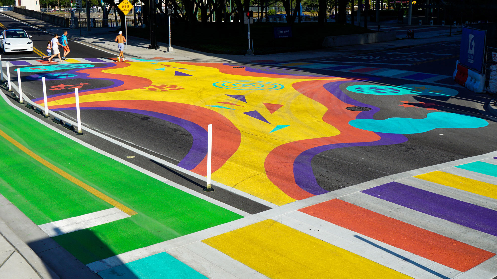
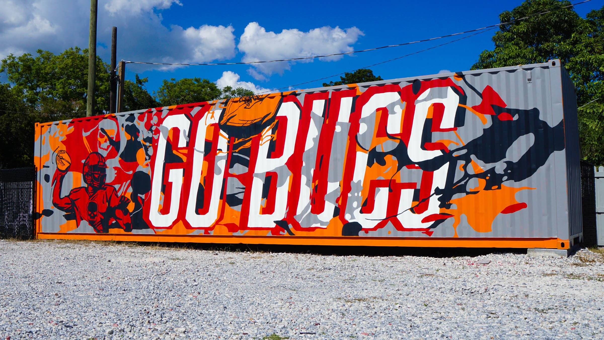
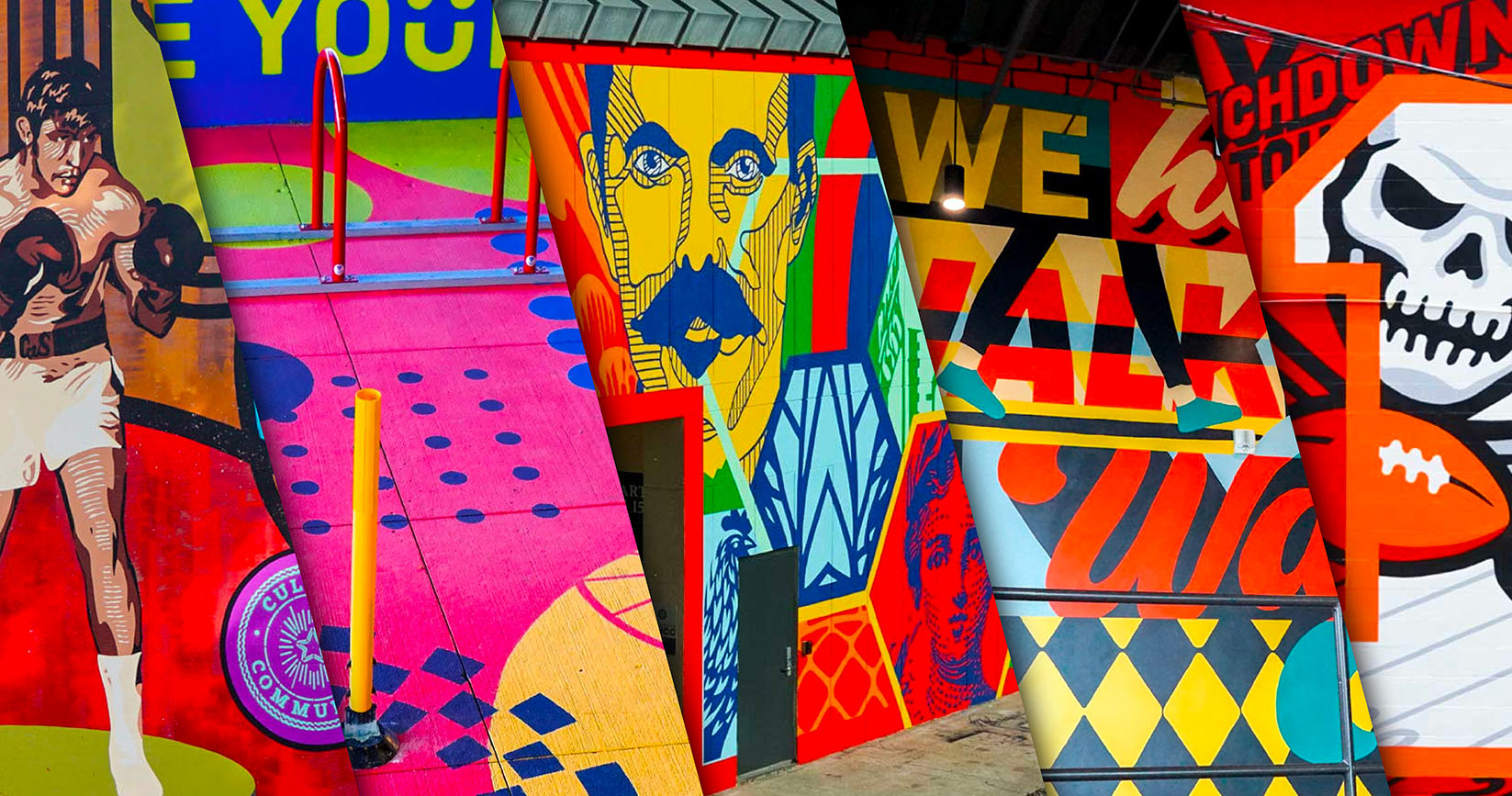
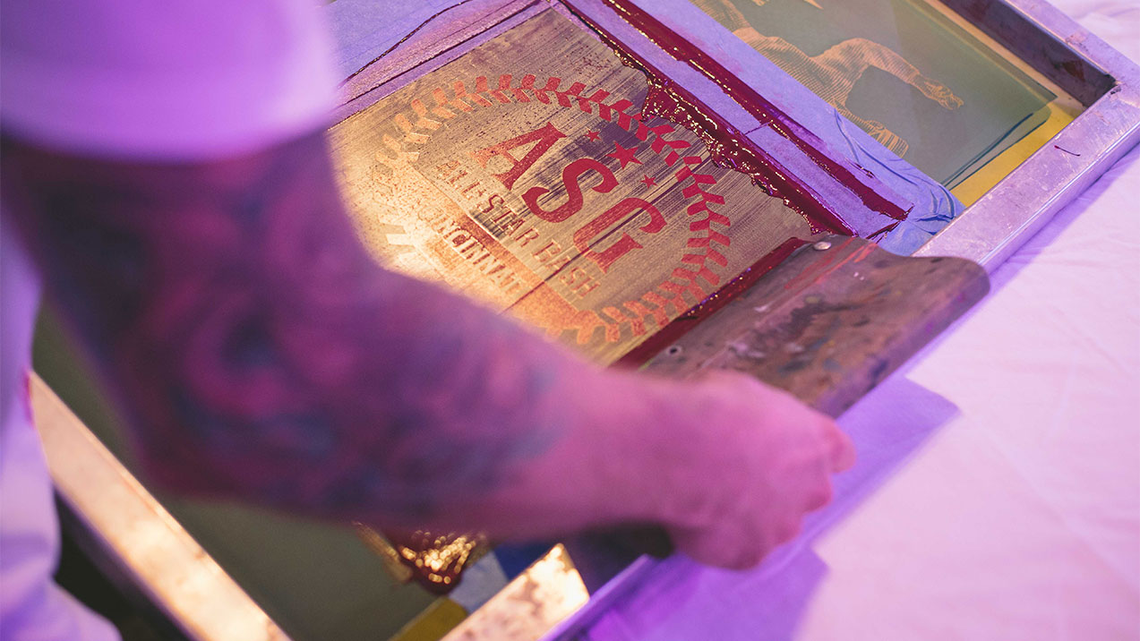
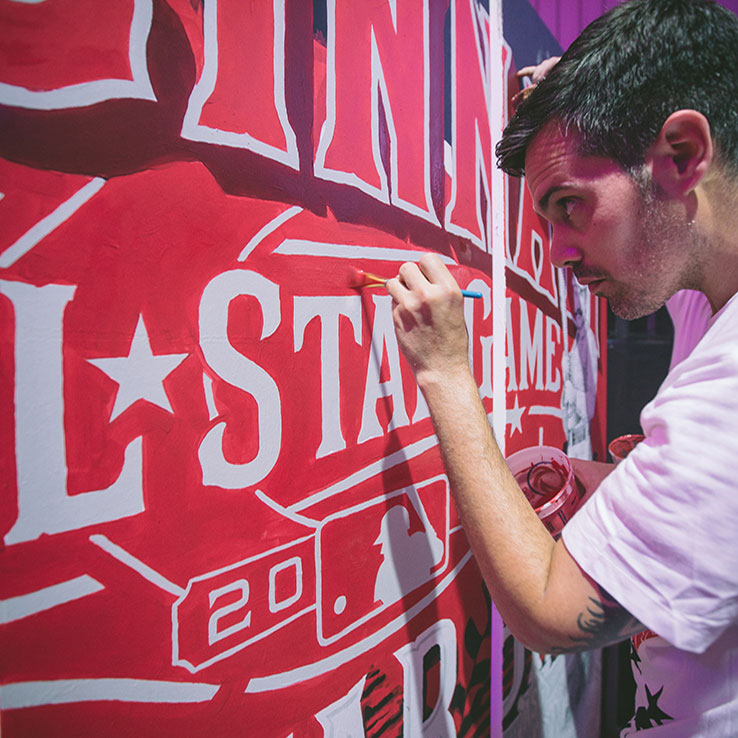
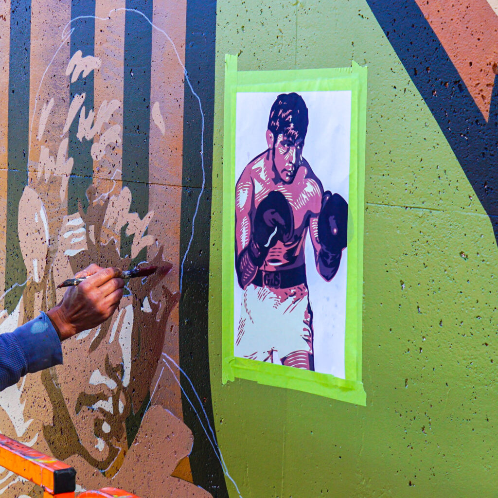
Greater Public Studio has had the opportunity to create art for a variety of clients within professional sports and other sports related businesses. Murals celebrating Tampa Bay’s championship level teams, a sculptural installation for the love of sport, and identity packaging for a local spot designed for sports fans are just a few examples of recent GPS projects centered around the intersection of sport and art. Athletics and the Arts have often been perceived as polar opposites. Both in professional and recreational terms, they are sometimes viewed as parallel paths; one defined by discipline, training and physical sacrifice and the other seen as free-spirited, unpredictable and unstructured. In our education system, kids are often defined by these binary options of becoming an athlete or being a theatre/band/art kid. From a young age, it’s implied that we should choose one path or the other.
In reality, the similarities and the symbiotic relationship between sports and art is valuable to understand. Athletics and art are both proof of life- evidence of our humanity. They provide a cultural watering hole, so to speak—a place to gather around a shared interest, to bond over likes, dislikes, and the newest developments. The experience of both can create an instant connection with someone you share nothing else in common with. But more than that, sports and art both require control, practice and sacrifice. Artist and athlete, Matthew Barney explores this concept with his Drawing Restraint series which advocates that growth only occurs through resistance. For an artist to “compete” on a professional level, one must devote themselves to their practice in the same way a professional athlete does.
The book Common Practice also explores the relationship between art and sport, specifically basketball. Hypebeast’s Keith Estiler points out that “the need to rehearse, discover and explore through the act of doing makes these two very different ideas of perfecting one’s craft very similar.” Interestingly, in the early years of the Olympics, competitors were awarded medals for the best sport inspired art. From 1912 until 1952, there were five Olympic categories for the arts: architecture, literature, music, painting, and sculpture. It was an integral part of the original vision for the Olympic games, according to its founder Baron Pierre de Coubertin. He felt that a true Olympian was not only athletic but also artistic (Stromberg, J. 2012, When the Olympics Gave Out Medals for Art. Smithsonian Magazine.)
While on the topic of medals, the use of color is an important aspect of the dynamic relationship between sports and art. Gold, silver, and bronze have become synonymous with winning. Color is strategically used by teams worldwide to identify and unify players and fans. It’s simple but the impacts are profound. For example, noticing gold (Pantone PMS 1235 C) and black together is immediately recognizable as the Pittsburgh Steelers, regardless of what part of the country you’re in. Blue (Pantone PMS 281 C) and white in Tampa Bay signals the Tampa Bay Lightning, unless its navy blue (Pantone PMS 648 C) and Columbia blue (Pantone PMS 278 C) with white, which is the Tampa Bay Rays. We become accustomed to these symbolic colors and learn to recognize them, even without the type or logos that often accompany them.
Art is creatively woven into every aspect of life. Sports are no exception.

