Angelo Machine
Industry:
Tattoo
Client:
Angelo Machine specializes in fine line fantasy and Japanese style tattooing.
Project:
A collaborative effort resulting in a fresh and minimal look.
Services:
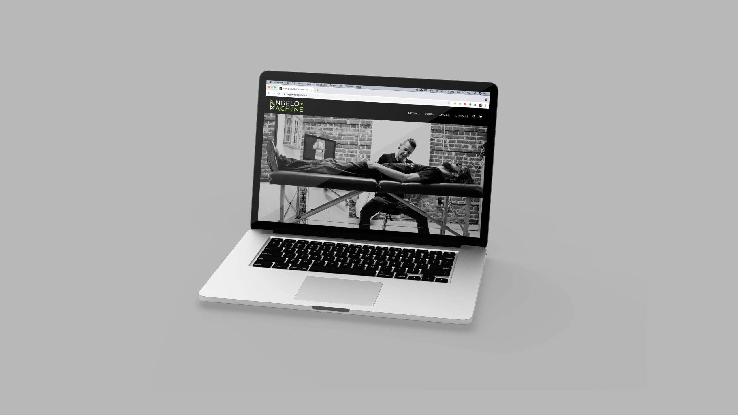
Visual Identity, Brand Strategy, Art Direction, and Web Design
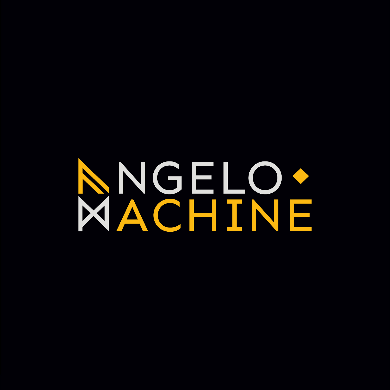

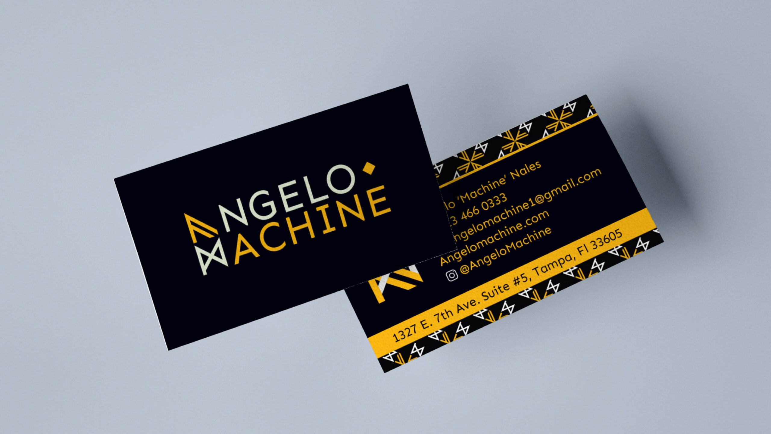
Tampa-based tattoo artist Angelo Machine came to us in need of a brand strategy and visual identity that reflects the fine, sharp lines he’s known for. In a crowded industry, we knew he needed a strong identity system that would stand out. Angelo’s clear vision led to a collaborative creative process that resulted in a visual identity expertly reflecting his brand– clean, minimal, and free from trends– ensuring it’ll last as long as his tattoos.

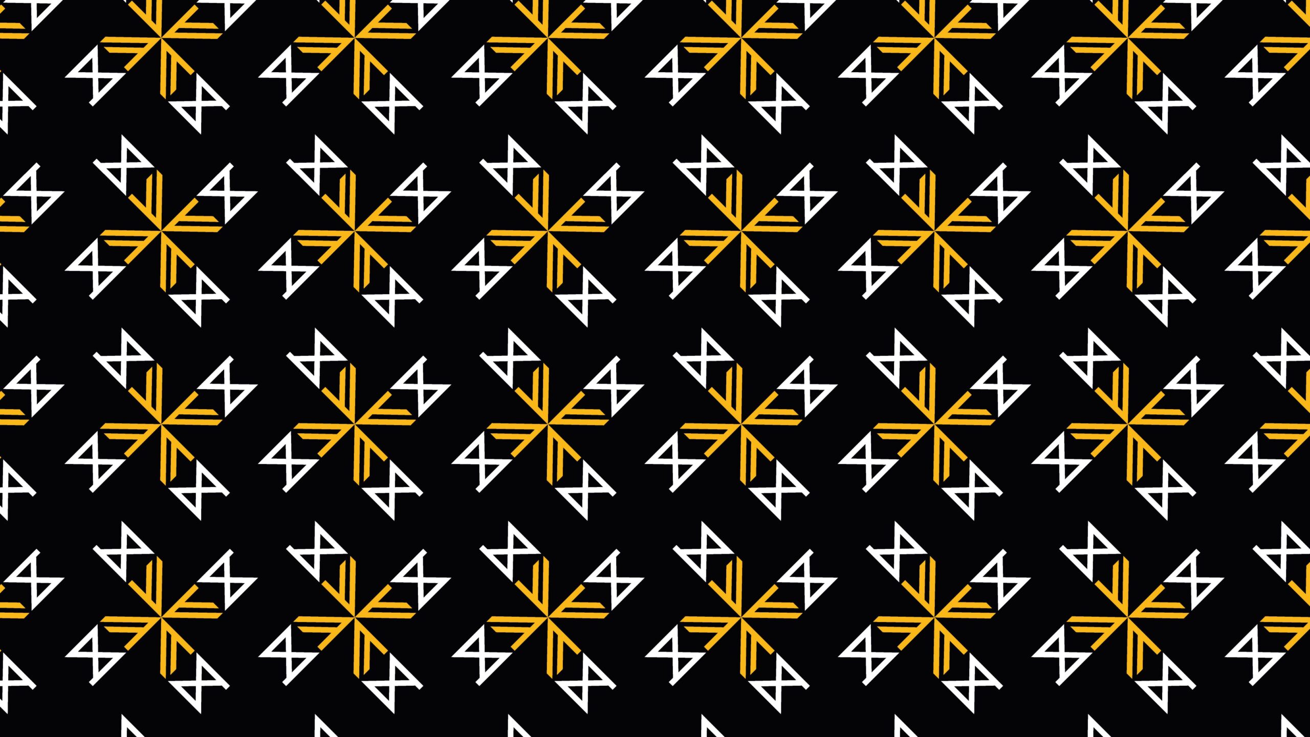
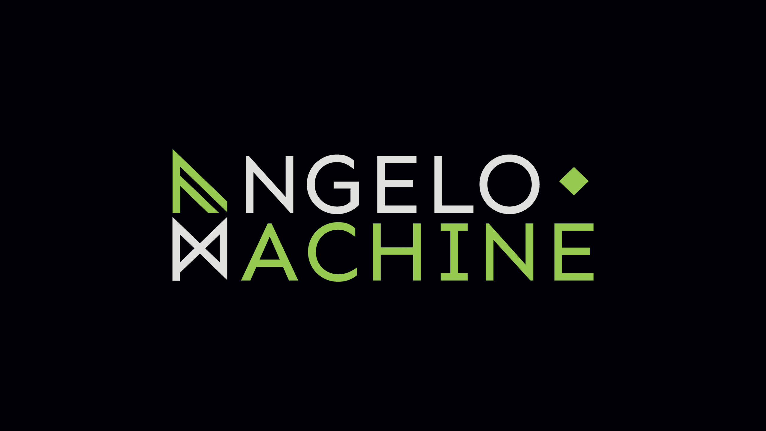
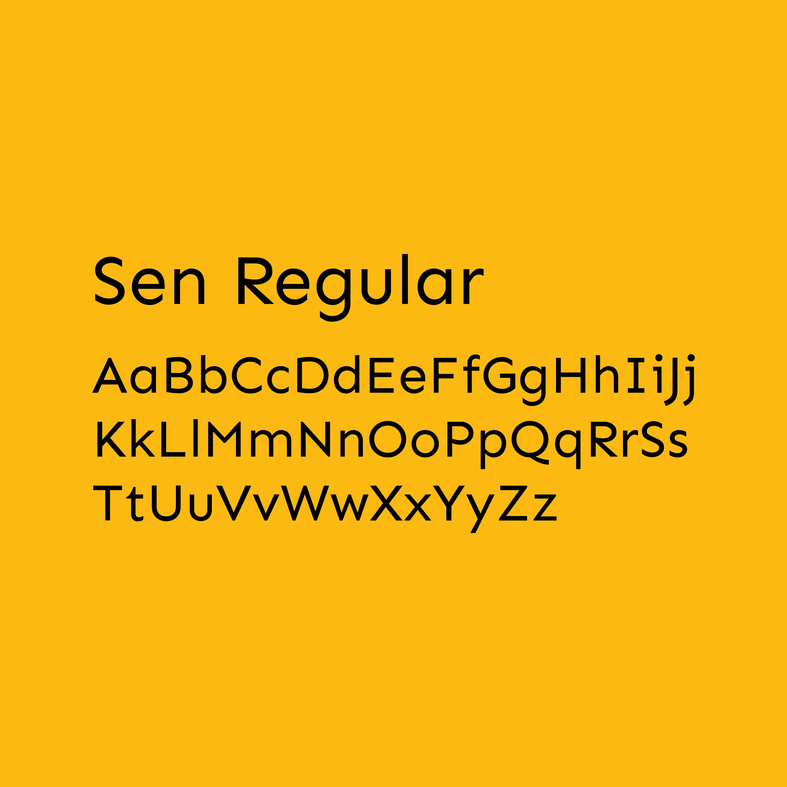
With creative use of the A and the M, the logo mark features subtle nods to one of the client’s favorite bands. A modern look with a timeless feel, Angelo Machine’s visual identity has a minimal color palette that transfers easily to print or web. The Sen Regular font leads the way with its gentle geometric lines that tie in naturally with the sharp logo mark.